
Data analytics is a big part of the tech industry and one of the key tools of any successful decision-making process. Having the right means to manage and visualize data can be a lifesaver in many situations. This is why, in this article, we will show how to use Python Dash to build a choropleth map app for data analytics and go over some Dash framework basics.
What is Dash?
According to the official documentation, “Dash is the original low-code framework for rapidly building data apps in Python, R, Julia, and F# (experimental).”
Dash was written on top of Plotly.js and React.js, making it an ideal tool for building and deploying data apps with customized user interfaces. Dash works by abstracting away all the technologies and protocols needed to build a full-stack web app that includes interactive data visualization through a couple of simple patterns.
Dash is so simple that it will take you less than 10 minutes to bind a user interface to your code.
An app developed with Dash is rendered on a web browser. It can be deployed to VMs or Kubernetes clusters to then share it through URLs. The fact that Dash is rendered on the web, means it’s also inherently cross-platform and mobile-ready!
All of these features make Dash quite popular; the framework is currently downloaded 600,000 times each month.
What can be done with Dash?
Well, Dash is just the pencil and you are the actual artist. However, to give an idea of what this framework can help you create, check out the Dash app gallery.
This is my personal favorite.
Building your first Dash graph
Now that you have some context, let’s get to it and build a Dash graph.
Install Python’s Dash
First, you’ll need to create a virtual environment and activate it.
virtualenv dashvenv
source ./dashvenv/bin/activate
Then, install Dash.
pip install dash
pip install jupyter-dash
pip install pandas
You can try running one of Dash’s ready-made examples; just create an app.py file and copy one of the following examples. For this article, we’ll be using the one below.
gist
Link: script
Test the installation
Now, run the example and see how it works.
# Run this app with `python app.py` and
# visit http://127.0.0.1:8050/ in your web browser.
Change the example
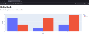
Dash includes a hot-reloading feature that is activated by default when running an app with app.run_server(debug=True). Therefore, Dash will automatically refresh your browser whenever you make a change to your code.
Give it a try by changing the title “Hello Dash” in your application or by changing the data on the x- or y-axis. Your app should auto-refresh with your changes.
The 3 pillars of Dash
We’ve shown you how to create an example graph app using Dash. Now it’s time to dig a little deeper into Dash itself by looking into three aspects of this framework: Dash components, plotly graphs, and Dash callbacks.
Dash components
dash_html_components (known as dash.html as of Dash version 2.0) includes a component class for each HTML tag, as well as keyword arguments for every HTML argument.
Dash provides supercharged components to help you create interactive user interfaces. You can find a core set of components (that are written and maintained by the Dash team) in the dash-core-components library.
When it comes to producing Dash apps, we’d advise you to manage the Dash Core Components styling and layout with Dash Enterprise.
Plotly graphs
Plotly’s Python graphing library helps you create interactive graphs with publication quality. The library includes a wide variety of examples showing you how to produce different plots, charts, histograms, heatmaps, and more. Plotly.py is free and open-source; this means you can view the source, report issues or even contribute on GitHub!
Dash callbacks
Dash apps use callback functions (i.e.: functions that are automatically called by Dash whenever an input component’s property changes), in order to update some property in another component (i.e.: the output).
Creating your own Python’s Dash app
Now that we’ve gone over the basics, it’s time to get serious.
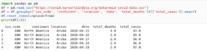
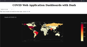
We will use a Covid-19 public dataset to create a world map with the pandemic evolution over time.
First, you need to pull the data as CSV and create a pandas dataframe that includes just the relevant information.
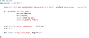
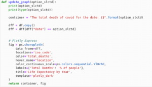
Then, create a Dash component that contains the following:
- DIV
- H1 header
- DROPDOWN slct_year, which will contain the dates of our dataset
- DIV output_container, a div that will display a user-friendly message
- A graph of the world heat map
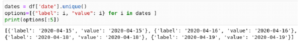
To do this, you’ll have to re-format the dates in an object to create the Dash dropdown component.
Then, you can create the app layout with your Dash components.
Now, you’ll need to create a callback function that will have the dropdown value as input, and the output_container and the map to update the information with the given input.
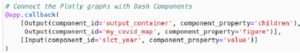
Then, you can define what to do with the input given value, that is, the selected year.
You then create the friendly message and the choropleth graph.
You can find more information about this plotly.express.choropleth here.
The data frame will be filtered by date; you can go ahead and add a continent filter, or add a selector for different values, such as vaccination percentage or tests performed.
If everything goes well, you should be able to run our app and see it working.
You can find the repository for this project here.
Final thoughts on data analytics using Python Dash framework
As we can see, amazing apps can be built with small pieces of code by using Python Dash framework. This is definitely a powerful tool for every developer to have in their toolkit. Moreover, as we all know, when it comes to building something complex, patience and practice are the keys to success. So start practicing!