

In the dynamic landscape of mobile app development, creating a user-friendly experience across various devices and screen sizes is paramount. FlutterFlow, a powerful and intuitive platform built on the Flutter framework, has emerged as a game-changer for developers seeking to streamline the app development process. In this article, we delve into the world of responsive design in FlutterFlow and explore how it enables the creation of seamless and visually appealing user interfaces.
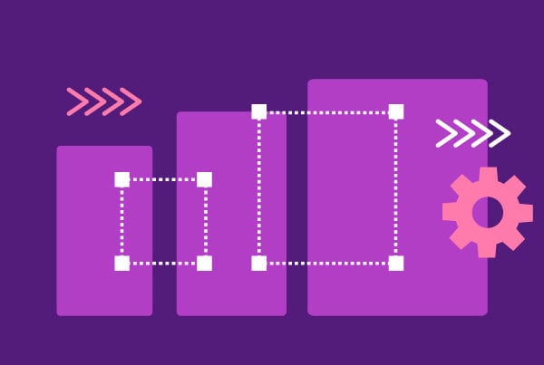
Understanding Responsive Design: Responsive design is a design approach that ensures a web or mobile application adapts to different devices and screen sizes. In the context of FlutterFlow, responsive design means crafting layouts and interfaces that dynamically adjust based on the device’s specifications, be it a smartphone, tablet, or desktop.
Key Components of Responsive Design in FlutterFlow
Layouts and Constraints
FlutterFlow provides a flexible layout system that allows developers to create responsive designs with ease. By leveraging constraints, developers can define how widgets behave when the screen size changes. This ensures that the UI components adapt fluidly to varying dimensions, providing a consistent user experience.
Media Queries
FlutterFlow incorporates media queries, a powerful tool commonly used in web development. Media queries enable developers to apply specific styles or layouts based on the characteristics of the device, such as screen width or height. This allows for the customization of the app’s appearance on different devices, ensuring optimal usability.
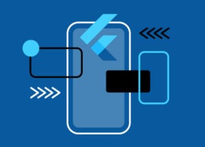
Widget Flexibility
Widgets are the building blocks of FlutterFlow applications, and their flexibility is key to achieving responsive designs. FlutterFlow offers a rich set of widgets that can automatically adjust their size and layout based on the available screen real estate. This adaptability is crucial for creating visually pleasing interfaces across a variety of devices.
Orientation Handling
FlutterFlow supports the dynamic handling of device orientations. Developers can specify different layouts for portrait and landscape modes, ensuring a seamless transition between the two. This capability is particularly important for apps that need to provide a consistent and engaging user experience regardless of how users hold their devices.
Best Practices for Responsive Design in FlutterFlow
Use Flexible and Expanded Widgets
Leverage FlutterFlow’s flexible and expanded widgets to create layouts that adjust proportionally to the available space. This ensures that UI elements scale gracefully on different devices.
Test Responsive Design Across Devices
Regularly test your app on various devices to ensure a consistent and polished user experience. FlutterFlow’s live preview feature allows developers to see real-time changes across different screen sizes during the development process.
Prioritize Content Accessibility
Responsive design is not just about adapting to different screen sizes but also about making content accessible. Ensure that text, images, and interactive elements remain clear and usable across devices.
Optimize Responsive Design Performance
Consider the performance implications of your design choices. Optimize assets and animations for different screen sizes to ensure a smooth and responsive user interface.
Conclusion
Responsive design in FlutterFlow empowers developers to create apps that seamlessly adapt to the diverse array of devices in the digital landscape. By embracing the platform’s robust layout system, media queries, and widget flexibility, developers can craft user interfaces that not only look visually appealing but also provide an optimal user experience on smartphones, tablets, and desktops. As the demand for cross-platform and responsive applications continues to grow, FlutterFlow stands out as a valuable tool for developers aiming to deliver exceptional user experiences across the entire spectrum of devices.
